Since Android 1.0 was released in 2008, Android has conquered 80% of the mobile market. There’s no doubt that Android is the present as well as the future. And Android is moving fast. Very fast.
Don’t believe me? Have a look for yourself at the Google I/O 2014 keynote. Remember Android 1.5 Cupcake? Or Android 2.2 Froyo? The time when Apple was boasting about the great design of iPhone apps? And where, to be honest, the Android user interface was not so great? Well, Android has come a long way. Version after version, Google has added new features which allow developers today to make Android apps which look as good, if not better, than their iOS counterparts. Of course, good design is not only about look. It’s also about functionality, usefulness, intuitiveness, unobtrusiveness, user-friendliness and aesthetics. As an Android developer, you need to be able to cope with this rapid pace.
Here are five things you should take into consideration when developing for the Android platform. This is not an exhaustive list but it should give you some insights on how to create great apps.

Supporting various screen sizes, orientations and devices
Our next Android Application Development training starts on Thursday 20 November 2014
Unlike iOS developers who have a limited number of devices to design for, as an Android developer, you have a more challenging job. You have to cater for the wide variety of devices and, failure to do so, inevitably means a risk of missing a large audience.
Fortunately, Android was developed with this in mind and Android will perform scaling and resizing to make your application work on different screens provided you follow design best practices. For example, using density-independent-pixels (dip) to specify components sizes is recommended. Android also allows you to provide images in various sizes for different kinds of devices.

Optimizing for tablets
Although Android performs scaling and resizing, you should make the effort to optimize your application for large screen sizes and densities especially tablets.
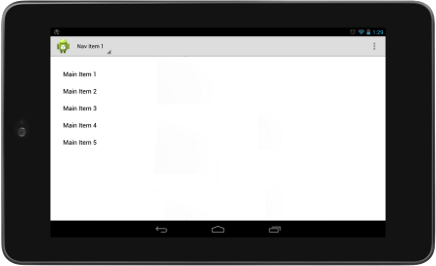
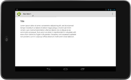
Here’s is an example of a typical list-detail application. The first screen displays a list of items. Clicking on one of those items, you get a second screen displaying the details related to that particular item.


The list screen and detail screen looks like they work in landscape on tablets. While this would look great on a 4″ smartphone, this design is not optimized for 7″ or 10″ tablets. The look is not great but the app is not optimally using the screen real estate as there are a lot of unused space. Optimizing the design for tablets might result in:

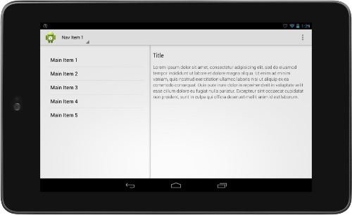
Here, a multi-pane layout is used to display both the list and details side by side. By clicking on one of the items in the list, the details for that particular item is updated. The design is much better as it makes better use of the available space and offers a better user experience. There is no need to switch from one screen to another. The only thing that it might need is some colors.
In Android 3.0 Honeycomb, fragments were added in Android which allows you to build more flexible and dynamic user interfaces. For example, the list and details parts above are distinct fragments which are shown on the same screen. Note that fragments have been backported to earlier versions of Android (1.6 Doughnut) thanks to the Android Support Library v4. Make sure to use them.

Using an action bar, touch gestures, a navigation drawer, etc.
Over the years, Android has introduced new features and patterns in order to provide a more appealing and rich user experience: the action bar, new touch gestures and the navigation drawer among others. You should leverage those capabilities in your app.
A word of caution here however: don’t use new features only because they exist! New UI features are introduced for to solve specific UI issues: some provide better navigation while others are used to allow users to better browse content. Make sure to understand the rationale behind each UI pattern and follow best practices!

Make sure that your app is intuitive and easy to use
Often, you might want to develop an application which will run on different platforms using a cross-platform framework such as Apache Cordova (aka Phonegap). While using the same code on different platforms can help you save time, it can greatly affect user experience.
You should be aware that there is a world of difference between Android and iOS (to take the two most common mobile platforms used worldwide). For instance, in Android, people expect to use the back button located at the bottom of a screen to move to a previous screen. In iOS, there is no permanent back button. iOS apps have to provide their own back functionality, for example, as a button at the top of the screen.
In general, people do things on their phones without really thinking. These are called user reflexes. Android users have developed reflexes when using Android applications. This is true for iOS users too. And, of course, the reflexes are not necessarily the same.
If your Android app doesn’t follow Android guidelines and design patterns, your users will have a really hard time figuring out how to perform simple tasks. Believe me: many will rapidly give up and just uninstall your app. Don’t try to mimic elements from other platforms: a back button at the top of an Android app is completely out of place!

Focus on the content
My last point will be about aesthetics. Confused? Aesthetics? What is this focus on the content?
Often, when you think about aesthetics, you think about what can be done to make your design pleasing to the eye only. But aesthetics is also about usability. Be particularly careful about making you app difficult to use while making it beautiful!
The solution is to use typography, regular grids, white space, bold colors and recognisable images.
Effective use of the above does much more than just please the eye: they create hierarchy, meaning and focus.
Our next Android Application Development training starts on Thursday 20 November 2014
Users download apps which provide them with information they need. Make this information prominent and easy to consume. Focus on the content. Focus on helping your users achieve their aims. Don’t use colours for the sake of having colours, use easy to read text with a nice typography and use white spaces to make the screen less crammed. You’ll have a beautiful app, simple to use, and loved by users.
During the last Google I/O conference, Google introduced Android 5.0 L, to be release at the end of the year, and one of the major innovation is Material Design.
Material Design is a new way to design apps to make them behave like real objects. UI components are placed on distinct layers with subtle shadows. They react when touched like real objects do. Material Design is not revolutionary. But it has the potential to make apps much easier to understand and use by normal people. And, we developers, need to cater for normal people.
Don’t forget to have fun in the process 😉

Leave a Reply