We have seen previously various best practices (such as using match_parent and wrap_content) for supporting different screen sizes. Android also allows us to provide several alternative layouts to target different screen configurations.
For example, let say we have an activity whose layout, found in the res/layout folder, is called activity_details.xml. This layout would be used for any device. However, Android allows us to create another folder, res/layout-large, in which we can have a different implementation of activity_details.xml. For example, in the activity_details.xml file found in res/layout, we can have an image whose width has been set to 100dp and in the activity_details.xml file found in res/layout-large, we can have an image whose width has been set to 200dp. In such a case, the activity_details.xml file found in res/layout-large would be selected on devices with screens classified as large.
Now, using the large size qualifier also has some limitations. Instead, we can use smallest-width qualifiers which allows us to specify specific screen sizes. For example, we can place the activity_details.xml file in the folder res/layout-sw600dp. Resources found in this folder would be used by devices whose smallest width is 600dp or more. Android also allows us to use orientation qualifiers such as res/layout-land where resources found in that folder would be used by devices in landscape mode.
Using the above mentioned qualifiers together with fragments, we can implement optimised and dynamic user interfaces which will adapt to different screen configurations quite easily.

SongExplorerForAll v3
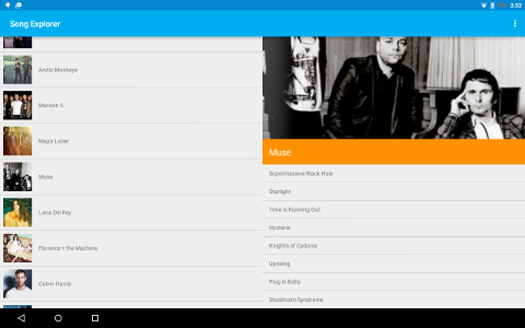
In SongExplorerForAll v2, we used fragments to replace activities. In SongExplorerForAll v3, we create the new folder res/layout-sw600dp and add a different implementation of activity_main.xml in it to be used by screens whose smallest width is 600dp or more.
We also modify our MainActivity to display the appropriate fragments and perform appropriate tasks depending on whether the device has a larger screen. The result is that on smartphones, users get a list of artists and when selecting one of the artists get the artist’s details in another screen. On tablets, the list of artists and the artist’s details are displayed side by side.


Leave a Reply